In what ways does your media product use, develop or challenge forms of conventions from real media products?
Frame 1: Title - The title of our film is "Sharpie". This is a play on words through the different meanings of it; one connotation is that it is related to sharp objects such as knives which our antagonist is shown to prefer, this is also the case for many other characters in thriller films, such as the masked man from V for Vendetta - even though he has access to a wide range of guns, he is shown to primarily use knives. The alternative connotation is the relation to the marker pen of the same name as our antagonist is shown to leave drawings on things/people similar to The Snowman where the killer leaves snowmen or messages for the protagonist.

The font we used was Biro. We felt that this was appropriate because it looks as though it has been hand-written, this could make the viewer feel somewhat uneasy because the antagonist would likely write in the style (somewhat messy) and it therefore makes him seem more realistic and believable. We also blurred the title a bit, this was to make it look more eerie and look similar to other title designs, such as: Seven where the title is white and features parts of it missing, alongside a more blurred out version in the background. We also took the idea of having a blurred out background version of it too, it makes it seem as though it is messing with the viewer and therefore, when combined with the fact that the antagonist drew the title, it breaks the fourth wall to an extent and makes the viewer feel more engaged than a basic title would.

Frame 2: Characters - There are four main characters in our trailer: the three teens/young adults and the antagonist. The teens are shown to be a stereotypical representation of their age group, this is demonstrated by the fact that they are out drinking together at one point. They are also joking around with each other on their way to the school. While it is usually older adults that are featured in thrillers, we wanted to use teens/young adults to easily construct the narrative; it makes more sense for them to be breaking into a location as younger people are typically shown to get into more trouble, such is the case with various teen angst films, such as Mean Girls where the plot revolves around a group of "mean girls". We also wanted to show that they were close friends through the use of the pub scene, this would make their characters more likable and believable.

Our antagonist is very stereotypical; he wears all black aside from a white, emotionless mask to conceal his identity. This mask also makes him more frightening as the viewer and protagonists have no idea who he is or what he wants. This is also similar to V for Vendetta, the man wears a mask fashioned to look like Guy Fawkes, and this gives him a sense of anonymity and leaves the viewer wondering whether he is good or bad until they see what he does in the trailer. The black clothes also make him blend into the darkness, making him even more dangerous as you don't know where he could be. This furthers the similarities between him and the masked main from V for Vendetta.

Frame 3: Settings - We filmed in settings expected to find teens/young adults - in a pub, streets and a school. The pub was mainly used to establish the protagonist's personality and show that they are quite carefree which is to be expected of people their age. The fact that they are stereotypical may also attract our audience as our target demographic is people of that age. The fact that they are shown to be normal could also add tension because the viewer doesn't know why the antagonist is threatening normal people like them.

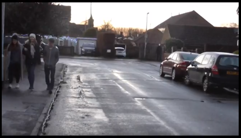
The street scenes were used to build on the protagonist's characters further as they are shown joking around. It also introduces the antagonist who appears from one of the alleyways in the background, he doesn't do anything except stare at them and then retreat back to the alleyway which makes him seem suspicious due to how out of place he is.

The school is the primary setting where the antagonist's true motives are revealed. It is also a binary opposition as to what usually happens in a school; schools are a safe place for children and teens, but the antagonist has turned it into a place of horror. This could be seen as a reflection of his mind - twisted. It also forces the protagonists to become counter-types (scared and frightened instead of happy and carefree) and therefore make the audience sympathise with them for being put into the situation.

Frame 4: Narrative - This clip is of a piece of paper stating "It's you I'm after!". It is shown at the end of the trailer; this leaves the viewer wondering why the antagonist is doing what he is doing until this scene. The preferred reading of this is that the viewer understands it is one person the antagonist wants as connoted by the fact one person rips the paper off of the lockers and the other two are shown to be taken. Alternatively, "you" could refer to the whole group, which has complete opposite connotations to the preferred reading (Oppositional reading). However, we felt this was appropriate as it is a psychological thriller and we want to confuse the viewer while making sure that they aren't completely lost.

This is similar to the trailer for The Snowman where one clip towards the end of the trailer shows some writing in the snow saying "I'm doing this for you mister policeman". This suggests that the antagonist knows a lot more about the protagonist, the the protagonist does the antagonist. This is also true for our trailer; the antagonist is actively seeking out one of the protagonists but the viewer doesn't know why. Furthermore, our trailer makes this element more suitable for the psychological thriller genre as we use the enigma code by leaving the audience questioning who the antagonist is, who they are chasing, and why they are chasing that specific person.
Frame 5: Video transitions - This clip and various others end in a quick cut to black or from one scene to another. This makes the pacing of the trailer seem a lot faster as it can be used to string together various different scenes. We mainly used this towards the end of the trailer when it was reaching its climax and the antagonist was shown a lot more. The start of the trailer was mainly fade to blacks because it is a lot slower paced and it is when the narrative is attempted to be established.

My favourite shot transition that we used was the mirror scene (above) where the main focal point is of the character in the mirror. This shot cuts to a different shot but then cuts back to it with the antagonist featured behind the protagonist. This again cuts to a different shot and then back, but this time shows the protagonist being dragged away by the antagonist. These three clips quickly built in with various other shots of action, I feel add to the dangerous feel of the antagonist by showing that he can be anywhere, at any time.
Frame 6: Camera shot - This is a bird's eye view of the location our film is set in - the school. We used a bird's eye view as it allows us to show the viewer the whole area. We put a news report over this explaining that a serious event had happened at the location. This makes the whole thing seem more serious and makes the atmosphere seem quite eerie because school's are supposed to be a safe place, this makes it very surprising and shocking when something serious/dangerous happens; it is the complete opposite of what you would expect to happen at a school.

We knew from the start that we wanted a news report explaining what had happened as it makes it seem more serious and professional. We had the idea during planning to film a bird's eye view over the news report. Originally we were going to use a drone, however, we were unable to retrieve the footage from the micro SD card, eventually we decided to film from the top of one of the buildings that got a view of the whole school and that worked well. We recorded the news report using an audio recorder and then had to remove the sound from the original clip due to it being very windy, and during editing we added the news report.
Frame 7: Props - In this frame, the antagonist has tied up one of the protagonists. The protagonist is tied up and his mouth is covered with tape. This is stereotypical for a thriller films as it is often related to torture/kidnapping where someone is trying to get another person to speak about something. The antagonist is also holding a pen as though he is about to draw on the protagonist which is what we wanted him to be remembered for (drawing on his victims), this suggests he is going to do something the protagonist. There is also only a bit of lighting, this could create a sense of unknown and confusion which is what we want the viewer to feel in our trailer as it is typical of a psychological thriller and it also leaves the viewer with questions which will only be answered if they watch the full film.

The pen is not very stereotypical for a thriller film, however, it fits with our narrative very well. It also fits with what we said - we want it to have stereotypical elements so that is recognisable, but we also want to confuse the viewer but not to the point where they are lost. This idea of drawing on victims is built on in The Snowman where the antagonist leaves images of snowmen for the detective to discover.
The key prop however, was the mask as part of the antagonist's costume (which I mentioned in frame 2).
Frame 8: Magazine cover - This frame is of the bottom left corner of my magazine cover. It features an incentive stating that there is a "free poster inside!" accompanied by an image of my poster. Incentives are a key convention of magazines as it persuades people to buy them as they are getting something that they can't get anywhere else. For example: gossip magazine may use an incentive of an exclusive interview with a star. An alternative incentive would be what I used where there is a free item inside, these are usually posters but can be different things - children's magazines usually come with toys as children enjoy them, similar to the way film watchers may enjoy a poster of a film they like. The incentive also stands out; it is a yellow triangle (taking up one of the thirds from the rule of thirds grid) and contrasts with the stereotypical blacks, greys and reds drawing the viewer's attention to it. While it is hard to see the whole poster, the main image is immediately obvious and it is staring directly at the viewer, this may further persuade them to buy it because of how engaged they are with the main image.

Frame 9: Poster - The frame I chose from my poster is from the top of it. It says "ADAM STUBBS" across the top and underneath that are three reviews, these are all covered in a smoky/foggy effect. The use of the name is to show that he is the main actor in the film, if this was a Hollywood blockbuster, it would likely be where the name of the main actor/actress would be, this is similar with the film "The Hole" where Keira Knightley is listed, except her name is under the tagline and listed along with two others. The main image also feature her, similar to how my main image features Adam in a mask. I also used reviews as a means of selling my film because only the positive ones are shown making people think the film must be good. They are also written by popular film reviewers who people trust. The fog effect is there to make the poster look more interesting, it also looks like the titles are appearing from the fog making it look more mysterious. The fonts are also important; the name is in a bold font so that people recognise who the main actor is. The reviews however are in a Biro font as it is the font most related to our film, the names of the reviewers are in the same font as the actor's name to establish them as being important.


The font we used was Biro. We felt that this was appropriate because it looks as though it has been hand-written, this could make the viewer feel somewhat uneasy because the antagonist would likely write in the style (somewhat messy) and it therefore makes him seem more realistic and believable. We also blurred the title a bit, this was to make it look more eerie and look similar to other title designs, such as: Seven where the title is white and features parts of it missing, alongside a more blurred out version in the background. We also took the idea of having a blurred out background version of it too, it makes it seem as though it is messing with the viewer and therefore, when combined with the fact that the antagonist drew the title, it breaks the fourth wall to an extent and makes the viewer feel more engaged than a basic title would.

Frame 2: Characters - There are four main characters in our trailer: the three teens/young adults and the antagonist. The teens are shown to be a stereotypical representation of their age group, this is demonstrated by the fact that they are out drinking together at one point. They are also joking around with each other on their way to the school. While it is usually older adults that are featured in thrillers, we wanted to use teens/young adults to easily construct the narrative; it makes more sense for them to be breaking into a location as younger people are typically shown to get into more trouble, such is the case with various teen angst films, such as Mean Girls where the plot revolves around a group of "mean girls". We also wanted to show that they were close friends through the use of the pub scene, this would make their characters more likable and believable.

Our antagonist is very stereotypical; he wears all black aside from a white, emotionless mask to conceal his identity. This mask also makes him more frightening as the viewer and protagonists have no idea who he is or what he wants. This is also similar to V for Vendetta, the man wears a mask fashioned to look like Guy Fawkes, and this gives him a sense of anonymity and leaves the viewer wondering whether he is good or bad until they see what he does in the trailer. The black clothes also make him blend into the darkness, making him even more dangerous as you don't know where he could be. This furthers the similarities between him and the masked main from V for Vendetta.

Frame 3: Settings - We filmed in settings expected to find teens/young adults - in a pub, streets and a school. The pub was mainly used to establish the protagonist's personality and show that they are quite carefree which is to be expected of people their age. The fact that they are stereotypical may also attract our audience as our target demographic is people of that age. The fact that they are shown to be normal could also add tension because the viewer doesn't know why the antagonist is threatening normal people like them.

The street scenes were used to build on the protagonist's characters further as they are shown joking around. It also introduces the antagonist who appears from one of the alleyways in the background, he doesn't do anything except stare at them and then retreat back to the alleyway which makes him seem suspicious due to how out of place he is.
The school is the primary setting where the antagonist's true motives are revealed. It is also a binary opposition as to what usually happens in a school; schools are a safe place for children and teens, but the antagonist has turned it into a place of horror. This could be seen as a reflection of his mind - twisted. It also forces the protagonists to become counter-types (scared and frightened instead of happy and carefree) and therefore make the audience sympathise with them for being put into the situation.

Frame 4: Narrative - This clip is of a piece of paper stating "It's you I'm after!". It is shown at the end of the trailer; this leaves the viewer wondering why the antagonist is doing what he is doing until this scene. The preferred reading of this is that the viewer understands it is one person the antagonist wants as connoted by the fact one person rips the paper off of the lockers and the other two are shown to be taken. Alternatively, "you" could refer to the whole group, which has complete opposite connotations to the preferred reading (Oppositional reading). However, we felt this was appropriate as it is a psychological thriller and we want to confuse the viewer while making sure that they aren't completely lost.

This is similar to the trailer for The Snowman where one clip towards the end of the trailer shows some writing in the snow saying "I'm doing this for you mister policeman". This suggests that the antagonist knows a lot more about the protagonist, the the protagonist does the antagonist. This is also true for our trailer; the antagonist is actively seeking out one of the protagonists but the viewer doesn't know why. Furthermore, our trailer makes this element more suitable for the psychological thriller genre as we use the enigma code by leaving the audience questioning who the antagonist is, who they are chasing, and why they are chasing that specific person.
Frame 5: Video transitions - This clip and various others end in a quick cut to black or from one scene to another. This makes the pacing of the trailer seem a lot faster as it can be used to string together various different scenes. We mainly used this towards the end of the trailer when it was reaching its climax and the antagonist was shown a lot more. The start of the trailer was mainly fade to blacks because it is a lot slower paced and it is when the narrative is attempted to be established.

My favourite shot transition that we used was the mirror scene (above) where the main focal point is of the character in the mirror. This shot cuts to a different shot but then cuts back to it with the antagonist featured behind the protagonist. This again cuts to a different shot and then back, but this time shows the protagonist being dragged away by the antagonist. These three clips quickly built in with various other shots of action, I feel add to the dangerous feel of the antagonist by showing that he can be anywhere, at any time.
Frame 6: Camera shot - This is a bird's eye view of the location our film is set in - the school. We used a bird's eye view as it allows us to show the viewer the whole area. We put a news report over this explaining that a serious event had happened at the location. This makes the whole thing seem more serious and makes the atmosphere seem quite eerie because school's are supposed to be a safe place, this makes it very surprising and shocking when something serious/dangerous happens; it is the complete opposite of what you would expect to happen at a school.

We knew from the start that we wanted a news report explaining what had happened as it makes it seem more serious and professional. We had the idea during planning to film a bird's eye view over the news report. Originally we were going to use a drone, however, we were unable to retrieve the footage from the micro SD card, eventually we decided to film from the top of one of the buildings that got a view of the whole school and that worked well. We recorded the news report using an audio recorder and then had to remove the sound from the original clip due to it being very windy, and during editing we added the news report.
Frame 7: Props - In this frame, the antagonist has tied up one of the protagonists. The protagonist is tied up and his mouth is covered with tape. This is stereotypical for a thriller films as it is often related to torture/kidnapping where someone is trying to get another person to speak about something. The antagonist is also holding a pen as though he is about to draw on the protagonist which is what we wanted him to be remembered for (drawing on his victims), this suggests he is going to do something the protagonist. There is also only a bit of lighting, this could create a sense of unknown and confusion which is what we want the viewer to feel in our trailer as it is typical of a psychological thriller and it also leaves the viewer with questions which will only be answered if they watch the full film.

The pen is not very stereotypical for a thriller film, however, it fits with our narrative very well. It also fits with what we said - we want it to have stereotypical elements so that is recognisable, but we also want to confuse the viewer but not to the point where they are lost. This idea of drawing on victims is built on in The Snowman where the antagonist leaves images of snowmen for the detective to discover.
The key prop however, was the mask as part of the antagonist's costume (which I mentioned in frame 2).
Frame 8: Magazine cover - This frame is of the bottom left corner of my magazine cover. It features an incentive stating that there is a "free poster inside!" accompanied by an image of my poster. Incentives are a key convention of magazines as it persuades people to buy them as they are getting something that they can't get anywhere else. For example: gossip magazine may use an incentive of an exclusive interview with a star. An alternative incentive would be what I used where there is a free item inside, these are usually posters but can be different things - children's magazines usually come with toys as children enjoy them, similar to the way film watchers may enjoy a poster of a film they like. The incentive also stands out; it is a yellow triangle (taking up one of the thirds from the rule of thirds grid) and contrasts with the stereotypical blacks, greys and reds drawing the viewer's attention to it. While it is hard to see the whole poster, the main image is immediately obvious and it is staring directly at the viewer, this may further persuade them to buy it because of how engaged they are with the main image.

Frame 9: Poster - The frame I chose from my poster is from the top of it. It says "ADAM STUBBS" across the top and underneath that are three reviews, these are all covered in a smoky/foggy effect. The use of the name is to show that he is the main actor in the film, if this was a Hollywood blockbuster, it would likely be where the name of the main actor/actress would be, this is similar with the film "The Hole" where Keira Knightley is listed, except her name is under the tagline and listed along with two others. The main image also feature her, similar to how my main image features Adam in a mask. I also used reviews as a means of selling my film because only the positive ones are shown making people think the film must be good. They are also written by popular film reviewers who people trust. The fog effect is there to make the poster look more interesting, it also looks like the titles are appearing from the fog making it look more mysterious. The fonts are also important; the name is in a bold font so that people recognise who the main actor is. The reviews however are in a Biro font as it is the font most related to our film, the names of the reviewers are in the same font as the actor's name to establish them as being important.

some good links evident to conventions of existing trailers such as The Snowman and se7en Jak and how you have emulated those in your own production.
ReplyDelete